I love oEmbed. The fact that you can just paste a url of something into an editor and it automatically embeds is fantastic. And while Twitter embeds do look pretty good out of the box, there are a few things that you can tweak to make it a bit better.
Center your embedded tweets
By default, tweets are left aligned when embedded. But you can change that with a bit of CSS. I’m surprised this isn’t the default behavior for tweets. Most people embed a tweet on it’s own line, and in most situations it looks much better to center tweets. Luckily, this is pretty easy to accomplish. Just add this to your website’s stylesheet, and tweets will be able to be centered:
Like this one:
Style the loading state of tweets
While tweets are loading, they will show up as regular text on the page within <blockquote> tags. This means any embedded tweets will show up on the page styled as a blockquote until the tweet finishes loading.
I style blockquotes to be large text with a lot of margins so that quotes get a lot of attention and focus in an article. Like this one:
The problem with quotes on the Internet is that it’s hard to verify their authenticity. In fact, most quotes on the internet are just made up.
Abraham Lincoln, 1999
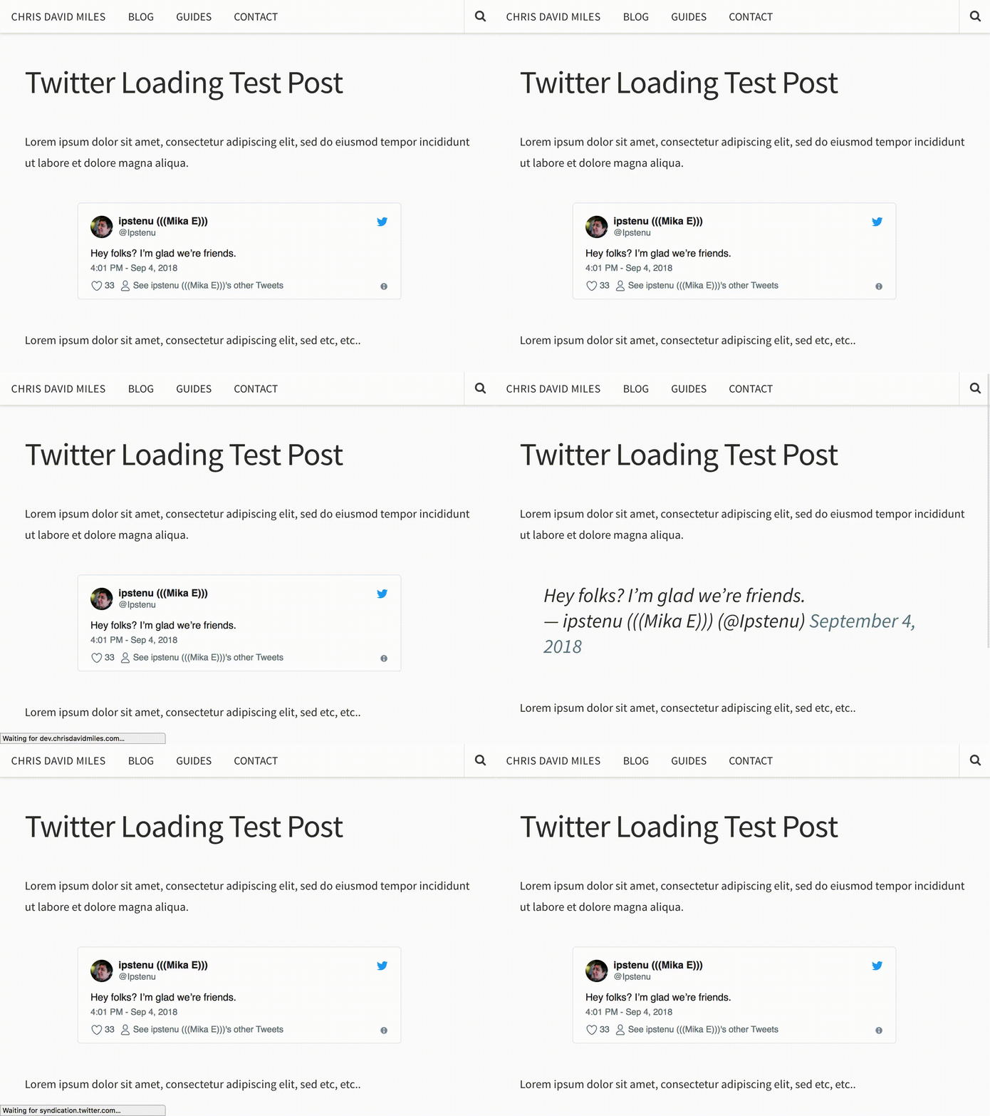
I like my quotes to look all big like that. But this becomes a problem when embedded tweets get blockquote css attached to them briefly while loading. Here’s a screen recording of what it looks like while a tweet loads (slowed down for detail).

So this is bad, especially now that tweets can be up to 280 characters. So to get around this, I added some CSS that applies to the tweet, only while it’s loading.
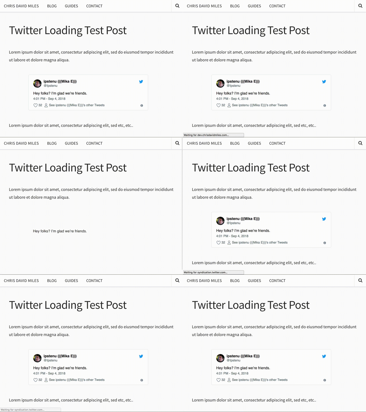
The HTML markup this CSS applies to is only present while the tweet is loading. After the change, it looks like this (slowed for detail)

This is much better, and less jarring of a change. So if you have a tweet near the top of the page, it would look like the page loading normally instead of a wacky blink/flicker of rapidly changing markup.
Style for after the tweet is loaded
I like the way tweets look by default, but if there’s something about them you want to change, twitter has published a guide to help. Check out CSS for embedded Tweets for more information.
